2025
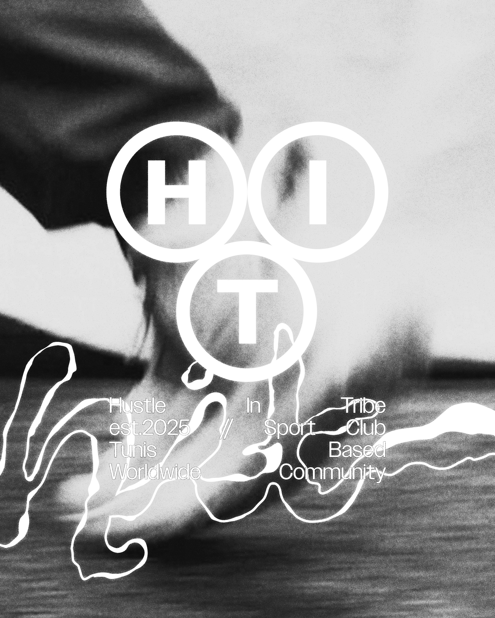
HIT-Hustle In Tribe
A raw, high-contrast visual system that utilizes industrial typography and desert-inspired art direction to define the lifestyle of a modern athletic tribe.
Lifestyle
Branding
Know More
We created the concept and full brand identity for HIT, a community-driven Padel and athletic brand built on the philosophy of collective energy. The identity focuses on the power of the "Tribe," positioning the sport not just as a game, but as a shared ritual of movement and hustle.
A Perfect Blend of Elegance and Functionality
HIT is built for those who find their rhythm in the collective grind. The visual language moves away from the traditional, bright-colored tropes of the sport, opting instead for a monochromatic, industrial palette that feels permanent and purposeful. Set against the vast, unforgiving beauty of the desert, the brand serves as a testament to human resilience and the power of the pack. Every element—from the high-contrast typography to the tactile, archival-inspired packaging—is designed to make the athlete feel like part of an elite unit where the hustle is a shared ritual.

Problem
The Isolation of Performance
Many high-end sports brands focus strictly on the individual, creating a cold and clinical atmosphere that ignores the social and tribal nature of sports like Padel. This leaves a gap for a brand that feels both premium and inclusive—one that acknowledges the grit of the "hustle" but places it within a community context. The challenge was to create a visual language that felt elite and technical without losing the grit and connection of a grassroots movement.


Solution
The Collective Uniform
The solution was to build an identity that functions as a badge of membership. We leaned into a "Hustle in Tribe" narrative, using bold, monolithic typography and tactile packaging that feels like shared equipment for a specialized unit. By using a monochromatic palette set against vast, cinematic landscapes, we shifted the focus from the court to the culture, ensuring the brand feels like a lifestyle choice that extends far beyond the final score.

Concept
The Ritual of the Hustle
The core concept is centered on the "HIT" acronym, serving as both a verb for the sport and a statement of impact. The visual direction treats the equipment as artifacts of a shared journey, utilizing "match cut" photography and structured layouts to document the tribe in motion. The typography is aggressive and grounded, reflecting the relentless nature of the hustle, while the spacious, airy compositions represent the freedom found within the tribe’s collective pursuit of excellence.

More Works
(GQ® — 02)
©2024


FAQ
01
What does Play.studio actually do?
02
Who is Play.studio for?
03
How is this different from a traditional design studio?
04
What does “play” mean in your process?
05
What services do you offer?
06
What’s your process like?
07
How long does a project take?
08
How do we start?
2025
HIT-Hustle In Tribe
A raw, high-contrast visual system that utilizes industrial typography and desert-inspired art direction to define the lifestyle of a modern athletic tribe.
Lifestyle
Branding
Know More
We created the concept and full brand identity for HIT, a community-driven Padel and athletic brand built on the philosophy of collective energy. The identity focuses on the power of the "Tribe," positioning the sport not just as a game, but as a shared ritual of movement and hustle.
A Perfect Blend of Elegance and Functionality
HIT is built for those who find their rhythm in the collective grind. The visual language moves away from the traditional, bright-colored tropes of the sport, opting instead for a monochromatic, industrial palette that feels permanent and purposeful. Set against the vast, unforgiving beauty of the desert, the brand serves as a testament to human resilience and the power of the pack. Every element—from the high-contrast typography to the tactile, archival-inspired packaging—is designed to make the athlete feel like part of an elite unit where the hustle is a shared ritual.
Problem
The Isolation of Performance
Many high-end sports brands focus strictly on the individual, creating a cold and clinical atmosphere that ignores the social and tribal nature of sports like Padel. This leaves a gap for a brand that feels both premium and inclusive—one that acknowledges the grit of the "hustle" but places it within a community context. The challenge was to create a visual language that felt elite and technical without losing the grit and connection of a grassroots movement.
Solution
The Collective Uniform
The solution was to build an identity that functions as a badge of membership. We leaned into a "Hustle in Tribe" narrative, using bold, monolithic typography and tactile packaging that feels like shared equipment for a specialized unit. By using a monochromatic palette set against vast, cinematic landscapes, we shifted the focus from the court to the culture, ensuring the brand feels like a lifestyle choice that extends far beyond the final score.
Concept
The Ritual of the Hustle
The core concept is centered on the "HIT" acronym, serving as both a verb for the sport and a statement of impact. The visual direction treats the equipment as artifacts of a shared journey, utilizing "match cut" photography and structured layouts to document the tribe in motion. The typography is aggressive and grounded, reflecting the relentless nature of the hustle, while the spacious, airy compositions represent the freedom found within the tribe’s collective pursuit of excellence.
More Works
(GQ® — 02)
©2024
FAQ
01
What does Play.studio actually do?
02
Who is Play.studio for?
03
How is this different from a traditional design studio?
04
What does “play” mean in your process?
05
What services do you offer?
06
What’s your process like?
07
How long does a project take?
08
How do we start?
2025
HIT-Hustle In Tribe
A raw, high-contrast visual system that utilizes industrial typography and desert-inspired art direction to define the lifestyle of a modern athletic tribe.
Lifestyle
Branding
Know More
We created the concept and full brand identity for HIT, a community-driven Padel and athletic brand built on the philosophy of collective energy. The identity focuses on the power of the "Tribe," positioning the sport not just as a game, but as a shared ritual of movement and hustle.
A Perfect Blend of Elegance and Functionality
HIT is built for those who find their rhythm in the collective grind. The visual language moves away from the traditional, bright-colored tropes of the sport, opting instead for a monochromatic, industrial palette that feels permanent and purposeful. Set against the vast, unforgiving beauty of the desert, the brand serves as a testament to human resilience and the power of the pack. Every element—from the high-contrast typography to the tactile, archival-inspired packaging—is designed to make the athlete feel like part of an elite unit where the hustle is a shared ritual.
Problem
The Isolation of Performance
Many high-end sports brands focus strictly on the individual, creating a cold and clinical atmosphere that ignores the social and tribal nature of sports like Padel. This leaves a gap for a brand that feels both premium and inclusive—one that acknowledges the grit of the "hustle" but places it within a community context. The challenge was to create a visual language that felt elite and technical without losing the grit and connection of a grassroots movement.
Solution
The Collective Uniform
The solution was to build an identity that functions as a badge of membership. We leaned into a "Hustle in Tribe" narrative, using bold, monolithic typography and tactile packaging that feels like shared equipment for a specialized unit. By using a monochromatic palette set against vast, cinematic landscapes, we shifted the focus from the court to the culture, ensuring the brand feels like a lifestyle choice that extends far beyond the final score.
Concept
The Ritual of the Hustle
The core concept is centered on the "HIT" acronym, serving as both a verb for the sport and a statement of impact. The visual direction treats the equipment as artifacts of a shared journey, utilizing "match cut" photography and structured layouts to document the tribe in motion. The typography is aggressive and grounded, reflecting the relentless nature of the hustle, while the spacious, airy compositions represent the freedom found within the tribe’s collective pursuit of excellence.
More Works
©2024
FAQ
What does Play.studio actually do?
Who is Play.studio for?
How is this different from a traditional design studio?
What does “play” mean in your process?
What services do you offer?
What’s your process like?
How long does a project take?
How do we start?