
2025
SPRINT
A high-contrast design system featuring bold technical typography, motion-blur photography, and geographic markers to define a new era of city-running gear.
Running Club
Branding
Know More
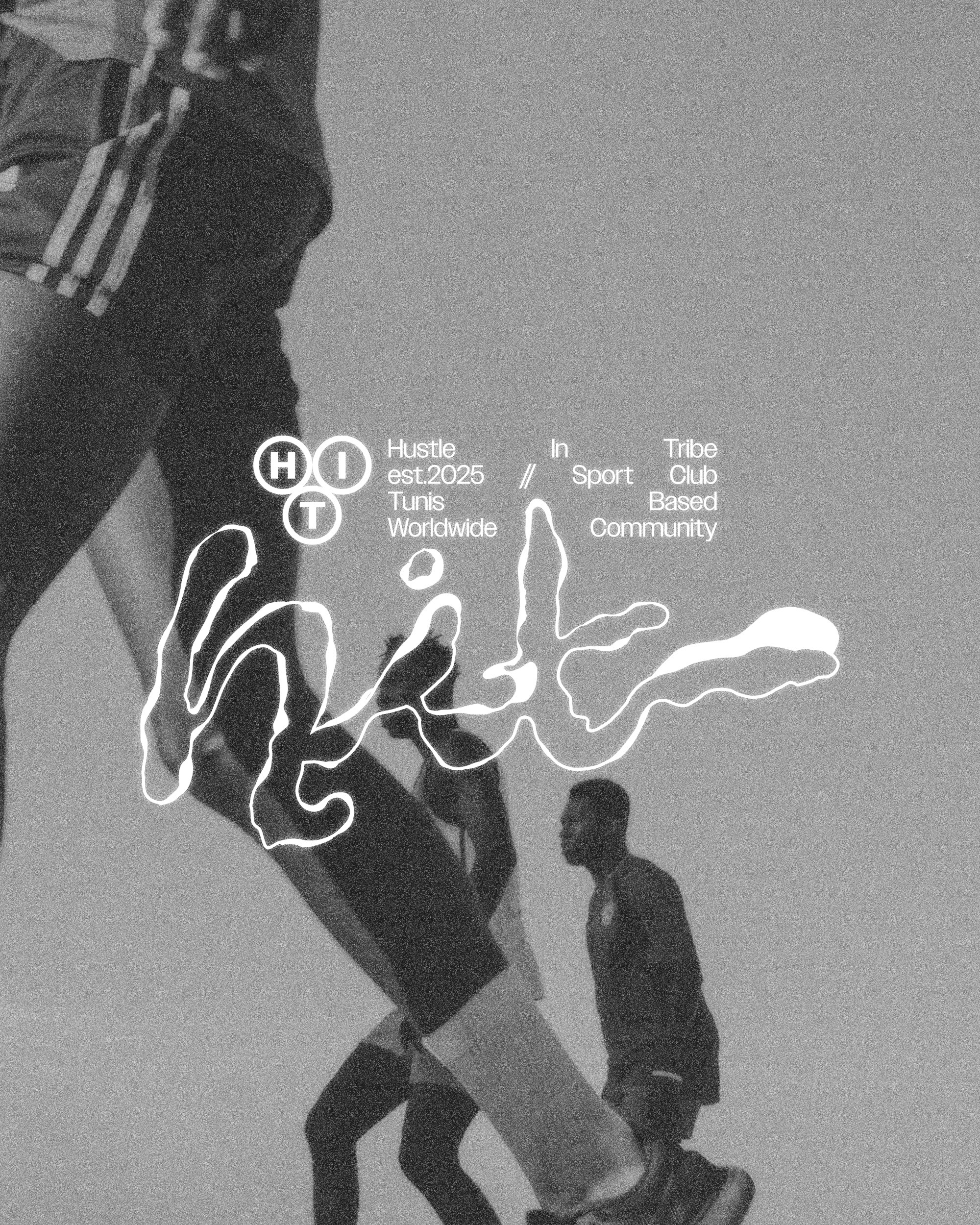
We engineered the full brand identity and visual language for SPRINT©, an apparel division built for the high-velocity movement of the modern city. The project centers on the "Urban Division" concept, blending technical performance with a stark, aggressive aesthetic that reflects the pace of Berlin’s street culture.
Urban Division / Berlin
A high-contrast design system featuring bold technical typography, motion-blur photography, and geographic markers to define a new era of city-running gear.

Problem
The Static Nature of Sportswear Branding
Most athletic branding relies on polished, sterile environments that fail to capture the actual grit and kinetic energy of urban running. Traditional sportswear often feels detached from the city it inhabits, lacking the "industrial" edge required to resonate with modern urbanites. The challenge was to create a brand that felt as fast and raw as the athletes themselves, moving away from clean commercial tropes and toward a more visceral, technical reality.


Solution
Engineered for Everyday Use
The solution was a identity system rooted in "Product Verification" and technical documentation. We utilized a high-visibility red against deep blacks and greys, creating a visual urgency that mirrors traffic signals and industrial warning signs. By incorporating the specific coordinates of Berlin and utilizing a "match cut" motion series, we transformed the apparel into a functional uniform for the city, emphasizing that every garment is a piece of engineered equipment.

Concept
Velocity in Motion
The core concept is defined by the tension between the silhouette and the blur. We paired a heavy, wide-set grotesque typeface with high-shutter and motion-streaked photography to visualize the physical sensation of a sprint. The "star" icon-mark serves as a simplified kinetic spark, representing the moment of impact and the relentless drive of the Urban Division. This system creates a brand that doesn't just represent sport, but captures the raw, documented momentum of the athlete in transit.

More Works
(GQ® — 02)
©2024

FAQ
01
What does Play.studio actually do?
02
Who is Play.studio for?
03
How is this different from a traditional design studio?
04
What does “play” mean in your process?
05
What services do you offer?
06
What’s your process like?
07
How long does a project take?
08
How do we start?
2025
SPRINT
A high-contrast design system featuring bold technical typography, motion-blur photography, and geographic markers to define a new era of city-running gear.
Running Club
Branding
Know More
We engineered the full brand identity and visual language for SPRINT©, an apparel division built for the high-velocity movement of the modern city. The project centers on the "Urban Division" concept, blending technical performance with a stark, aggressive aesthetic that reflects the pace of Berlin’s street culture.
Urban Division / Berlin
A high-contrast design system featuring bold technical typography, motion-blur photography, and geographic markers to define a new era of city-running gear.
Problem
The Static Nature of Sportswear Branding
Most athletic branding relies on polished, sterile environments that fail to capture the actual grit and kinetic energy of urban running. Traditional sportswear often feels detached from the city it inhabits, lacking the "industrial" edge required to resonate with modern urbanites. The challenge was to create a brand that felt as fast and raw as the athletes themselves, moving away from clean commercial tropes and toward a more visceral, technical reality.
Solution
Engineered for Everyday Use
The solution was a identity system rooted in "Product Verification" and technical documentation. We utilized a high-visibility red against deep blacks and greys, creating a visual urgency that mirrors traffic signals and industrial warning signs. By incorporating the specific coordinates of Berlin and utilizing a "match cut" motion series, we transformed the apparel into a functional uniform for the city, emphasizing that every garment is a piece of engineered equipment.
Concept
Velocity in Motion
The core concept is defined by the tension between the silhouette and the blur. We paired a heavy, wide-set grotesque typeface with high-shutter and motion-streaked photography to visualize the physical sensation of a sprint. The "star" icon-mark serves as a simplified kinetic spark, representing the moment of impact and the relentless drive of the Urban Division. This system creates a brand that doesn't just represent sport, but captures the raw, documented momentum of the athlete in transit.
More Works
(GQ® — 02)
©2024
FAQ
01
What does Play.studio actually do?
02
Who is Play.studio for?
03
How is this different from a traditional design studio?
04
What does “play” mean in your process?
05
What services do you offer?
06
What’s your process like?
07
How long does a project take?
08
How do we start?
2025
SPRINT
A high-contrast design system featuring bold technical typography, motion-blur photography, and geographic markers to define a new era of city-running gear.
Running Club
Branding
Know More
We engineered the full brand identity and visual language for SPRINT©, an apparel division built for the high-velocity movement of the modern city. The project centers on the "Urban Division" concept, blending technical performance with a stark, aggressive aesthetic that reflects the pace of Berlin’s street culture.
Urban Division / Berlin
A high-contrast design system featuring bold technical typography, motion-blur photography, and geographic markers to define a new era of city-running gear.
Problem
The Static Nature of Sportswear Branding
Most athletic branding relies on polished, sterile environments that fail to capture the actual grit and kinetic energy of urban running. Traditional sportswear often feels detached from the city it inhabits, lacking the "industrial" edge required to resonate with modern urbanites. The challenge was to create a brand that felt as fast and raw as the athletes themselves, moving away from clean commercial tropes and toward a more visceral, technical reality.
Solution
Engineered for Everyday Use
The solution was a identity system rooted in "Product Verification" and technical documentation. We utilized a high-visibility red against deep blacks and greys, creating a visual urgency that mirrors traffic signals and industrial warning signs. By incorporating the specific coordinates of Berlin and utilizing a "match cut" motion series, we transformed the apparel into a functional uniform for the city, emphasizing that every garment is a piece of engineered equipment.
Concept
Velocity in Motion
The core concept is defined by the tension between the silhouette and the blur. We paired a heavy, wide-set grotesque typeface with high-shutter and motion-streaked photography to visualize the physical sensation of a sprint. The "star" icon-mark serves as a simplified kinetic spark, representing the moment of impact and the relentless drive of the Urban Division. This system creates a brand that doesn't just represent sport, but captures the raw, documented momentum of the athlete in transit.
More Works
©2024
FAQ
What does Play.studio actually do?
Who is Play.studio for?
How is this different from a traditional design studio?
What does “play” mean in your process?
What services do you offer?
What’s your process like?
How long does a project take?
How do we start?