2025
ORA
A technical, high-contrast visual system that utilizes motion-centric art direction and industrial typography to define the next generation of urban athletic wear.
Sport Wear
Branding & Marketing
Know More
A technical, high-contrast visual system that utilizes motion-centric art direction and industrial typography to define the next generation of urban athletic wear.
ORA is built on the philosophy
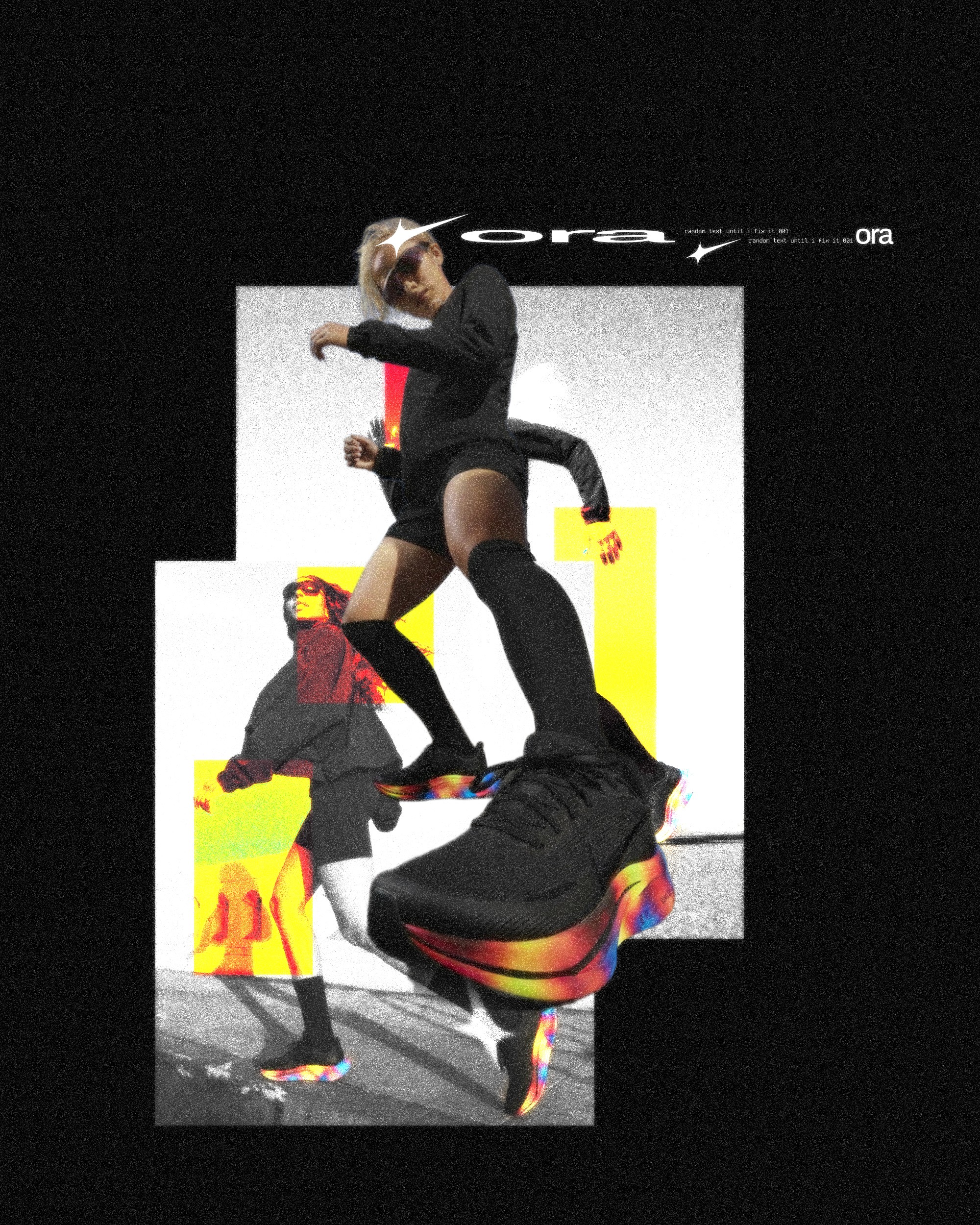
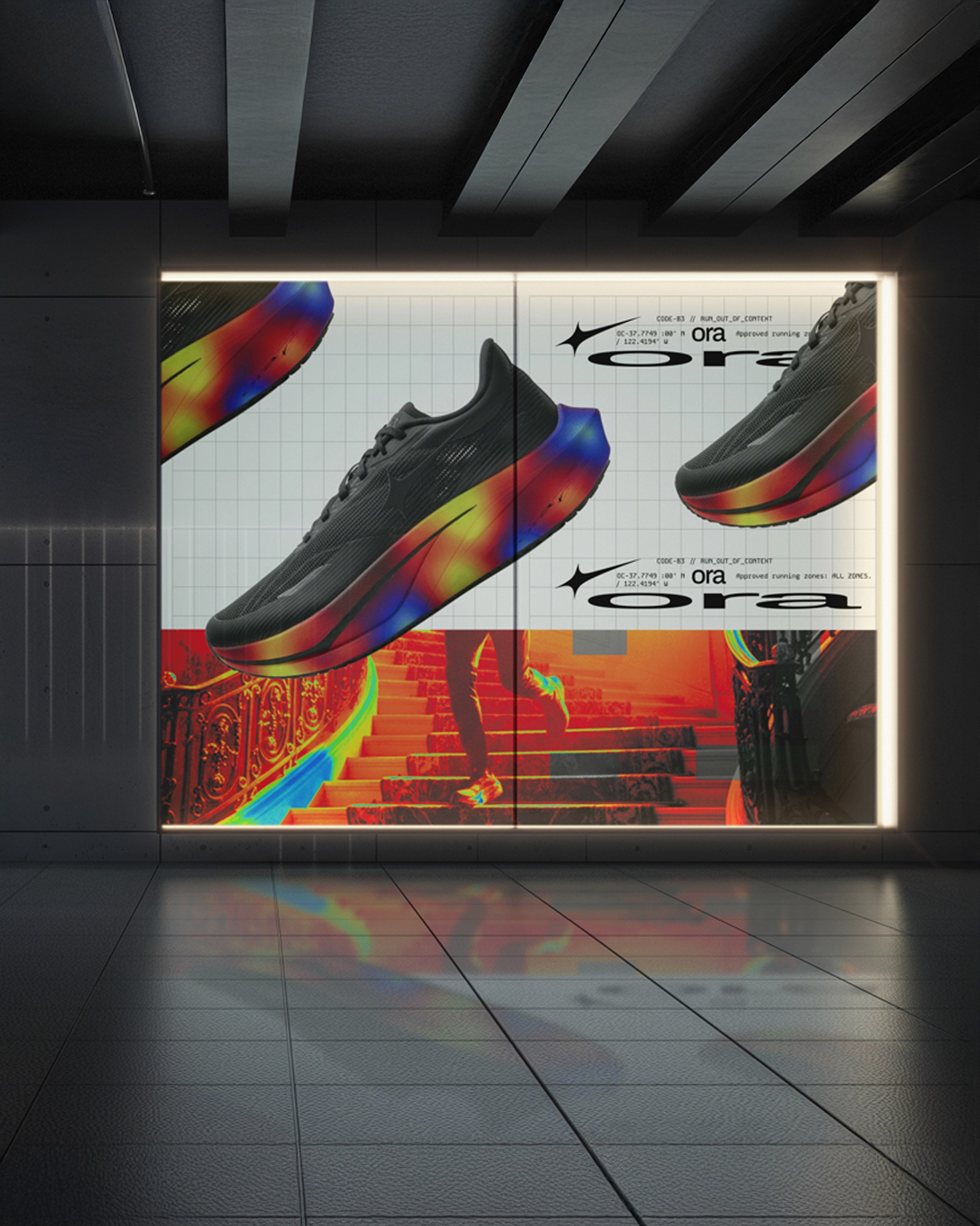
We engineered the full brand identity and visual narrative for ORA, a high-performance activewear brand designed for the relentless pace of urban movement. The project focuses on the intersection of technical garment engineering and the visceral energy of city-running culture. By combining aggressive typography with high-shutter speed photography, we positioned ORA as a functional tool for the modern athlete—one that bridges the gap between raw street aesthetic and elite athletic performance.
Problem
The Static Nature of Sportswear
Traditional athletic branding often feels disconnected from the chaotic and kinetic environments where athletes actually train. By relying on sterile studio shots and generic "motivational" tropes, many brands fail to capture the grit and physical momentum of city running. The challenge was to create an identity that felt inherently fast—a brand that could communicate high-velocity movement through a static medium while maintaining a premium, engineered feel.
Solution
The Documented Motion System
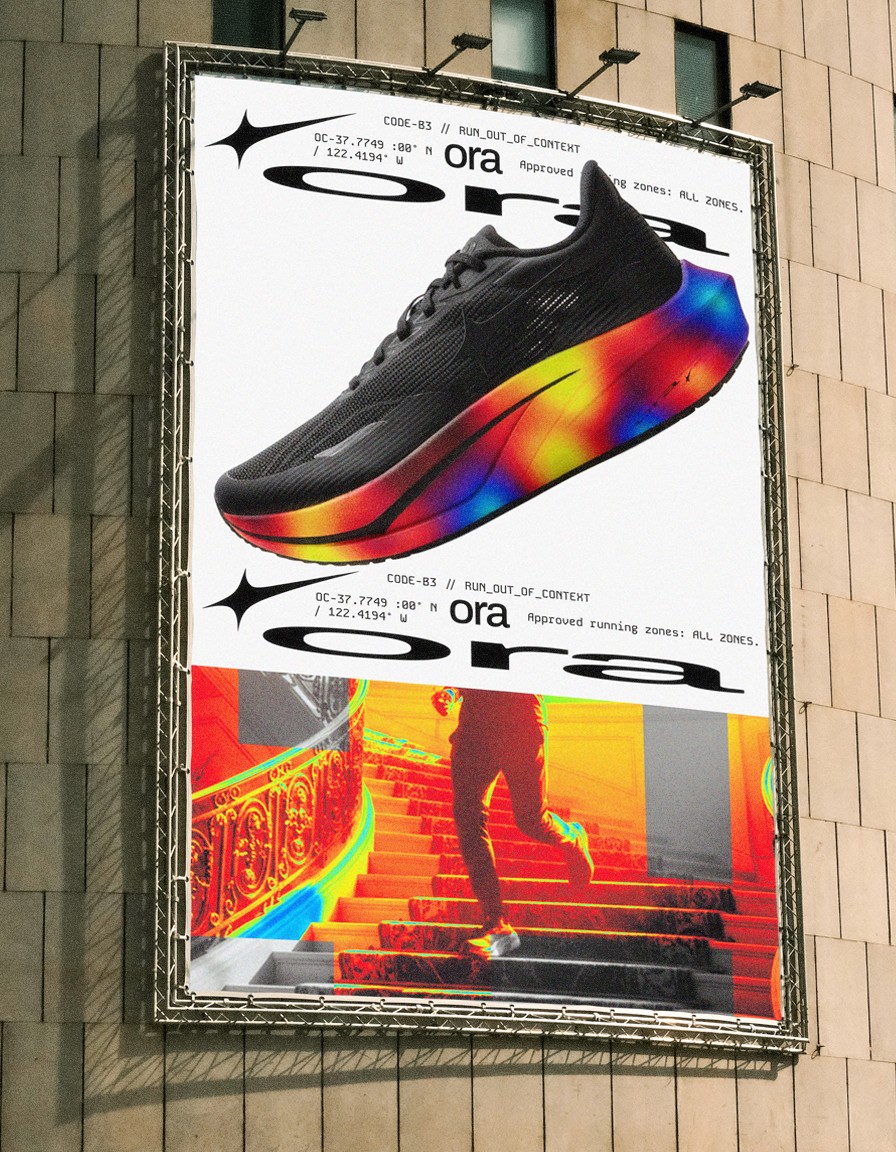
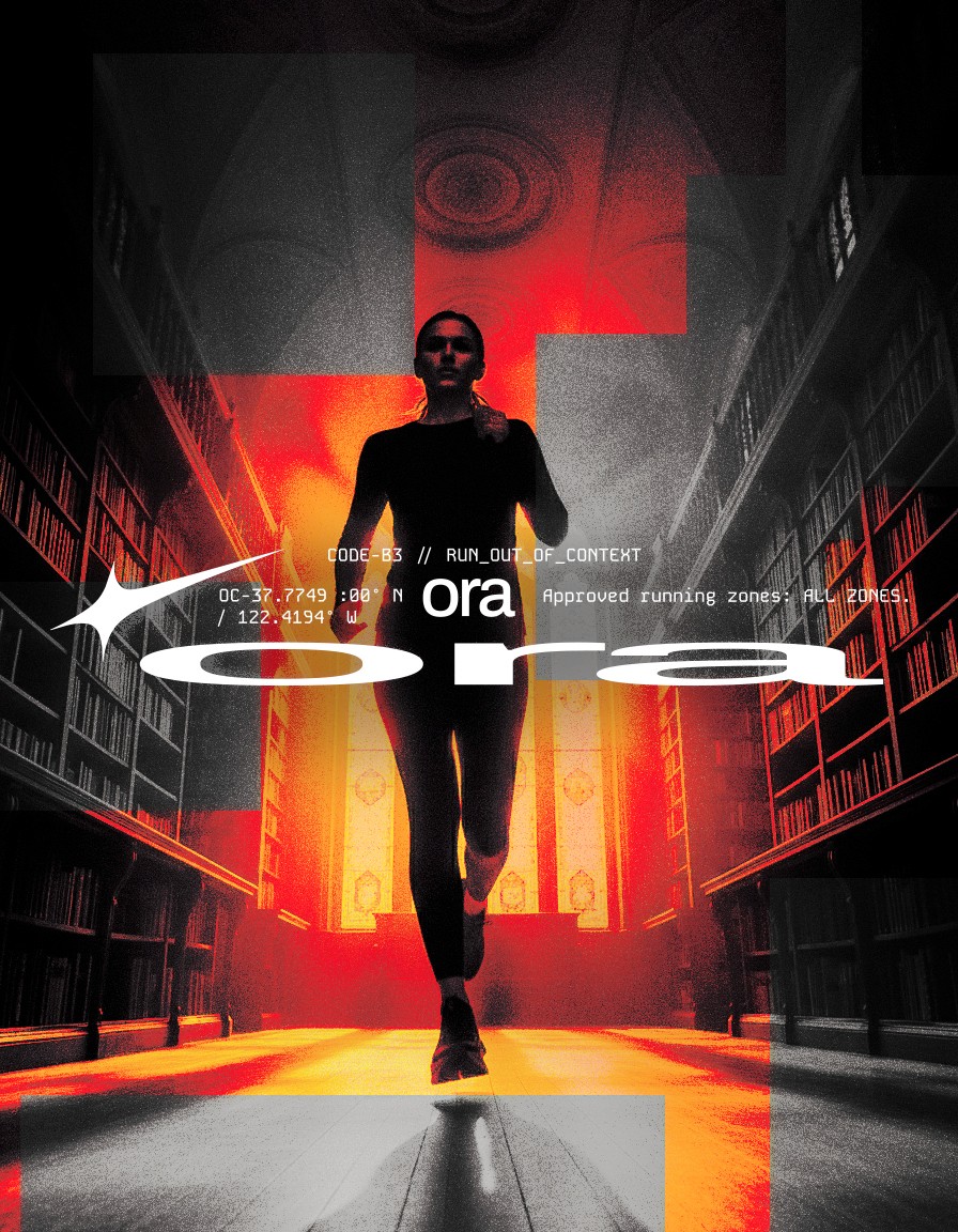
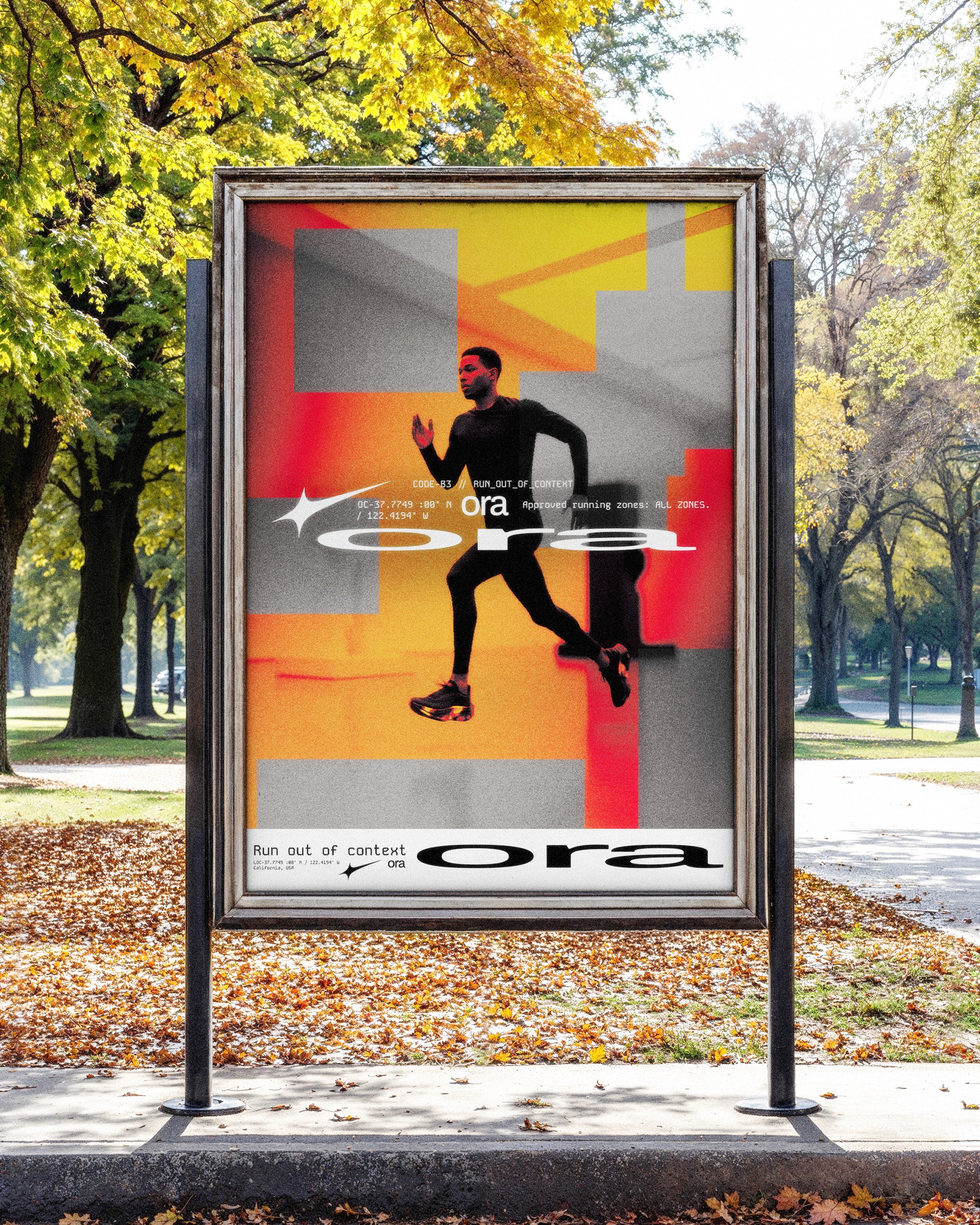
The solution was to treat the brand identity as a piece of technical documentation. We utilized a "match cut" visual strategy, ensuring that products remain anchored in the frame while the world around them blurs into a trail of light and energy. By incorporating technical data points—such as geographic coordinates, product verification stamps, and structural hierarchies—we transformed the apparel into "equipment." This approach grounds the high-energy photography with a sense of professional precision and reliability.
Concept
Velocity & Verification
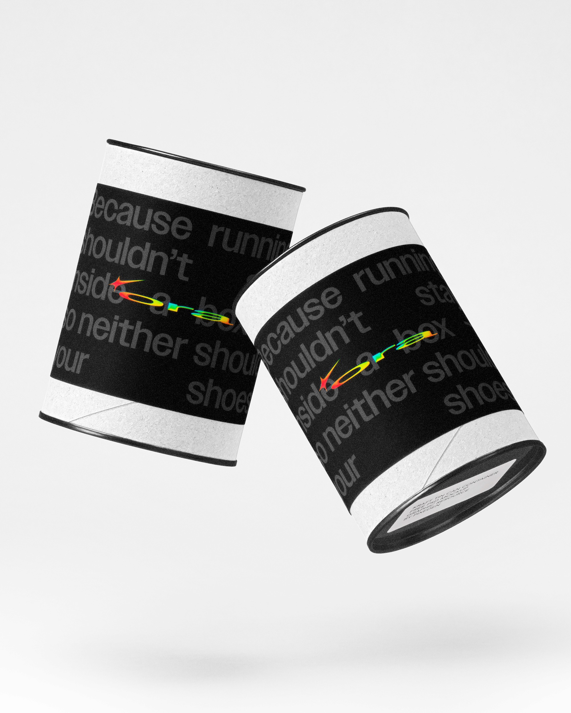
The core concept revolves around the "Kinetic Spark"—a visual representation of the moment impact meets momentum. We paired a heavy, wide-set grotesque typeface with extreme negative tracking to convey a sense of compressed power and stability. The use of a high-visibility red against a monochromatic field serves as an industrial warning, signaling the presence of the Urban Division. This concept ensures that ORA isn't just seen as clothing, but as a verified system for navigating the city at speed.
More Works
(GQ® — 02)
©2024
FAQ
01
What does Play.studio actually do?
02
Who is Play.studio for?
03
How is this different from a traditional design studio?
04
What does “play” mean in your process?
05
What services do you offer?
06
What’s your process like?
07
How long does a project take?
08
How do we start?
2025
ORA
A technical, high-contrast visual system that utilizes motion-centric art direction and industrial typography to define the next generation of urban athletic wear.
Sport Wear
Branding & Marketing
Know More
A technical, high-contrast visual system that utilizes motion-centric art direction and industrial typography to define the next generation of urban athletic wear.
ORA is built on the philosophy
We engineered the full brand identity and visual narrative for ORA, a high-performance activewear brand designed for the relentless pace of urban movement. The project focuses on the intersection of technical garment engineering and the visceral energy of city-running culture. By combining aggressive typography with high-shutter speed photography, we positioned ORA as a functional tool for the modern athlete—one that bridges the gap between raw street aesthetic and elite athletic performance.
Problem
The Static Nature of Sportswear
Traditional athletic branding often feels disconnected from the chaotic and kinetic environments where athletes actually train. By relying on sterile studio shots and generic "motivational" tropes, many brands fail to capture the grit and physical momentum of city running. The challenge was to create an identity that felt inherently fast—a brand that could communicate high-velocity movement through a static medium while maintaining a premium, engineered feel.
Solution
The Documented Motion System
The solution was to treat the brand identity as a piece of technical documentation. We utilized a "match cut" visual strategy, ensuring that products remain anchored in the frame while the world around them blurs into a trail of light and energy. By incorporating technical data points—such as geographic coordinates, product verification stamps, and structural hierarchies—we transformed the apparel into "equipment." This approach grounds the high-energy photography with a sense of professional precision and reliability.
Concept
Velocity & Verification
The core concept revolves around the "Kinetic Spark"—a visual representation of the moment impact meets momentum. We paired a heavy, wide-set grotesque typeface with extreme negative tracking to convey a sense of compressed power and stability. The use of a high-visibility red against a monochromatic field serves as an industrial warning, signaling the presence of the Urban Division. This concept ensures that ORA isn't just seen as clothing, but as a verified system for navigating the city at speed.
More Works
(GQ® — 02)
©2024
FAQ
01
What does Play.studio actually do?
02
Who is Play.studio for?
03
How is this different from a traditional design studio?
04
What does “play” mean in your process?
05
What services do you offer?
06
What’s your process like?
07
How long does a project take?
08
How do we start?
2025
ORA
A technical, high-contrast visual system that utilizes motion-centric art direction and industrial typography to define the next generation of urban athletic wear.
Sport Wear
Branding & Marketing
Know More
A technical, high-contrast visual system that utilizes motion-centric art direction and industrial typography to define the next generation of urban athletic wear.
ORA is built on the philosophy
We engineered the full brand identity and visual narrative for ORA, a high-performance activewear brand designed for the relentless pace of urban movement. The project focuses on the intersection of technical garment engineering and the visceral energy of city-running culture. By combining aggressive typography with high-shutter speed photography, we positioned ORA as a functional tool for the modern athlete—one that bridges the gap between raw street aesthetic and elite athletic performance.
Problem
The Static Nature of Sportswear
Traditional athletic branding often feels disconnected from the chaotic and kinetic environments where athletes actually train. By relying on sterile studio shots and generic "motivational" tropes, many brands fail to capture the grit and physical momentum of city running. The challenge was to create an identity that felt inherently fast—a brand that could communicate high-velocity movement through a static medium while maintaining a premium, engineered feel.
Solution
The Documented Motion System
The solution was to treat the brand identity as a piece of technical documentation. We utilized a "match cut" visual strategy, ensuring that products remain anchored in the frame while the world around them blurs into a trail of light and energy. By incorporating technical data points—such as geographic coordinates, product verification stamps, and structural hierarchies—we transformed the apparel into "equipment." This approach grounds the high-energy photography with a sense of professional precision and reliability.
Concept
Velocity & Verification
The core concept revolves around the "Kinetic Spark"—a visual representation of the moment impact meets momentum. We paired a heavy, wide-set grotesque typeface with extreme negative tracking to convey a sense of compressed power and stability. The use of a high-visibility red against a monochromatic field serves as an industrial warning, signaling the presence of the Urban Division. This concept ensures that ORA isn't just seen as clothing, but as a verified system for navigating the city at speed.
More Works
©2024
FAQ
What does Play.studio actually do?
Who is Play.studio for?
How is this different from a traditional design studio?
What does “play” mean in your process?
What services do you offer?
What’s your process like?
How long does a project take?
How do we start?